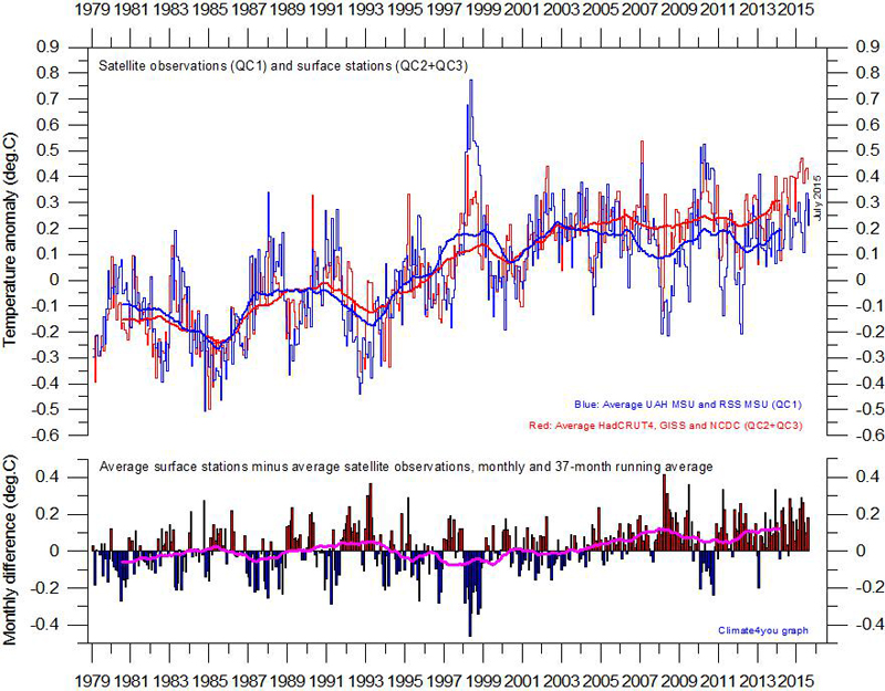
Detta diagram är hämtat från den norske
professorn Ole Humlum hemsida om klimatet och temperaturmätningar,
”climate 4 you”. Se
http://climate4you.com/ Hans kommentar till texten följer nedan.
Plot showing the average of monthly global surface air temperature estimates (HadCRUT4, GISS and NCDC) and satellite-based temperature estimates (RSS MSU and UAH MSU). The thin lines indicate the monthly value, while the thick lines represent the simple running 37 month average, nearly corresponding to a running 3 yr average. The lower panel shows the monthly difference between surface air temperature and satelitte temperatures. As the base period differs for the different temperature estimates, they have all been normalised by comparing to the average value of 30 years from January 1979 to December 2008. Last month included: July 2015. Last diagram update: 19 September 2015.
Dvs att sedan I synnerhet från 2005 avviker de markbaserade mätningarna mer från satellitmätningarna. När man förra året hävdade att 2014 var det varmaste året hittills gick man bara efter de markbaserade speciellt GISS. Satellitmätningarna visar inte någon temperaturstigning sedan början av 2000-talet.