
Links about weather and climate so you can check for
yourself
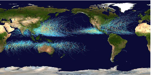
Ice area in the Arctic
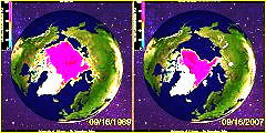
http://arctic.atmos.uiuc.edu/cryosphere/
First, look at diagrams of ice in the Arctic (top) and Antarctic (further
down the
page). How is the trend at the North and South Pole in terms of sea ice?
Total sea ice area? Look at the chart,
"Global Sea Ice Area" at the bottom of the page. Further down on this
page, look at "Compare side by side." Then compare certain dates. Least ice
in 2007. The smallest ice area is in the month of September. Compare 2007
with 2009!
Diagram with ice area during the year
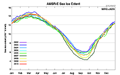
http://www.ijis.iarc.uaf.edu/en/home/seaice_extent.htm
Follow the ice area day after day.
Arctic temperature by DMI
http://ocean.dmi.dk/arctic/meant80n.uk.php
Daily
average temperature since 1958. Compare the 2000's with the 50’s
to check temperature change around the
North Pole. Has it become warmer in the summer now or in the winter
time? What are the average temperatures during each season?
Degrees in Kelvin, the blue lines is zero. The green line is the average
temperature since 1958.
Then compare with the following chart. Red line average temperature, green
line
summertemperature.
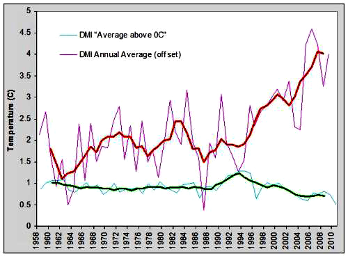
DMI summer melt season temperatures and annual DMI temperature anomaly as
well as
five year running averages constructed from DMI figures. Copied from:
http://www.skepticalscience.com/print.php?r=286
Global temperature
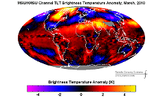
http ://www.remss
.com/msu/msu_data_monthly.html
Chose
the anomaly, then check different months in different years. Compare Feb.
2010 to Feb. 1998, both are El Niño months. Next, look at Sept 1980, Oct
1983, January 1988, Aug. 1992, June 1996. All are cold months after major
volcanic eruptions as St. Helens USA 1980, El Chichon Mexico in 1982,
Augustin Alaska in 1986, Pinatubo
Philippines in 1991, Mont Serrat Caribbean 1995. All are large
volcanic eruptions that caused that the average temperature was slightly
lower in the 80's and 90's than in the 2000’s. The greatest impact comes
sometimes a year later. There have been eruptions in 2010 but not as great
as in the previous decades. By far the biggest was Pinatubo. Recently a
volcano in Iceland had eruptions but the impact was not so great. Compare
different months in the 80's with 2000’s
and you see that the last decade has been warmer. What were the warmest
winters in the 2000’s?
Charts over global temperature
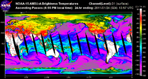
http://discover.itsc.uah.edu/amsutemps/
Daily
average temperature: Chose for example “Sea Surface”, then you can
compare temperature at different
altitudes. Click the altitude and year. Why was
the temperature so high during the first
half of 2010? Answer El Niño. How is it at higher elevations?
Sealevel
1.
Esa
satellite Envisat
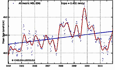
http ://www.aviso.oceanobs
.com/en/news/ocean-indicators/mean-sealevel/products-images/index.html
You will see a map with the oceans in colors that show sea-level change. To
see
the chart click below on "Multimission." Now you see the result from several
different satellites together. Then click on Envisat then you see the most
recent years with the best satellite. Then you can try with various
corrections.
If
you want you can chose
https://earth.esa.int/web/guest/missions/esa-operational-eo-missions/envisa
and then link to the right "Where is Envisat." You can see here
that the satellite is polar ie. it circulates around the earth along
different meridians of longitude, but it always passes the poles. You can
then also look to the universe with a click and see not only stars but also
planets.
2. Sea level change, University of Colorado
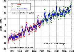
http://sealevel.colorado.edu/
Scroll down the page, first check the chart of sea level increases. How many
mm / year? What would this mean in 100 years? Click on the link “Interactive
wizard”, click on the local trend, and then click somewhere on the map or
add a request for coordinates, click on submit. A diagram will appear above
the sea level at the current location, it will not work at the North Sea,
unfortunately. Check for
example the Maldives and small islands as Tuvalu in the Pacific. You can
also see
with the colors how the sea surface is changing. Compare the east and west
in the Pacific for the year 1998. Why was it that big fluctuations that
year?
Answer a super El Niño.
How this is mesured is explained at Argo
homepage:
http://www.argo.ucsd.edu/About_Argo.html
Nasa monitoring the earth
http ://earthobservatory.nasa.gov/GlobalMaps/
Global maps. Try the different phenomena on Earth's surface over a period of
several years. For example: Ocean temperature changes during the year. Check
the North-West Atlantic Current. The
vegetation changes during the year, check the chlorophyll in the
ocean with sea algae, how the snowpack changes during the year. Why does it
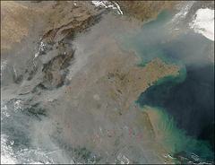
seems to be no snow at the North Pole during the winter? Aerosols (particles
in the air) which comes from burning and deserts. Click on Fire and then on
Aerosol Optical Depth. This gives you two maps simultaneously. You can now
see how the fires in Africa or at certain times the sands in the Sahara
contributes to the aerosols in the air.
Nasa article about a greener earth
http ://earthobservatory.nasa.gov/Features/GlobalGarden/
Click
up a larger map. This is perhaps the finest map available on the earth. Even
the Amazon has become greener, but what about Africa and for example China.
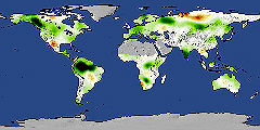
Snow area in the world
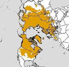
http://climate.rutgers.edu/snowcover/
Snow
area on earth week by week. Go to the tabular weekly. Check February
week number 7 this year. How was snow
area in Sqkm. Any year that has more snow than week 7 2010?
Check
also seasonal extent under “Graphs”. Compare wintertime with springtime. You
can see that the spring is coming earlier. In Sweden we like it.
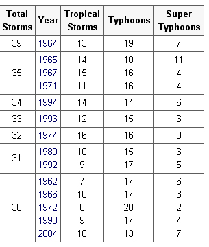
Tropical storms in the Atlantic and West
Pacific
Atlantic Ocean and East Pacific
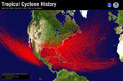
http ://www.nhc.noaa.gov/pastprofile.shtml
Scroll down the page. There you can see which sides of the Atlantic that is
affected
most by the cyclones.
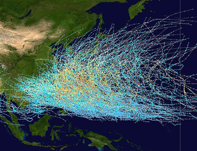
West Pacific
Thinning of Ozonlayer
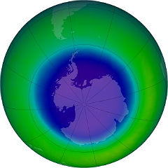
http ://ozonewatch.gsfc.nasa.gov/
Down on the page, you can see from a diagram how thin the ozone layer is, and
the
area for different years. Then click the "historical ozone maps" then you can
choose
different months in the fall of different years to see the largest ozone holes.
Is it just
the Antarctic or are more countries as Australia and New Zealand affected by
this
hole?
Climate4you
In conclusion:
One site with a lot of statistics about climate is
http://www.climate4you.com
maintained by the Norwegian professor Ole
Humlum.
He is one of the few Scandinavian scientist cited by the IPCC in their
fourth report.
As an example we use a few of his diagrams:
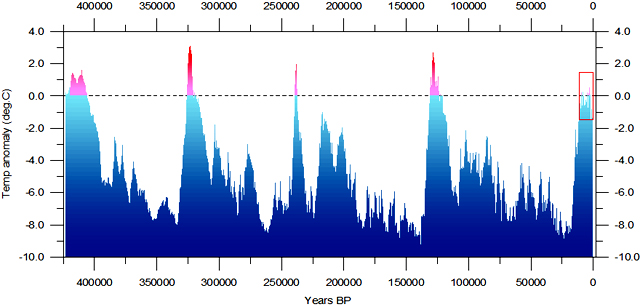
Fig.2. Reconstructed global temperature over the past 420,000 years based on the
Vostok ice core from the Antarctica (Petit et al. 2001). The record spans over
four
glacial periods and five interglacials, including the present. The horizontal
line indicates the modern temperature. The red square to the right indicates the
time interval shown in greater detail in the following figure.
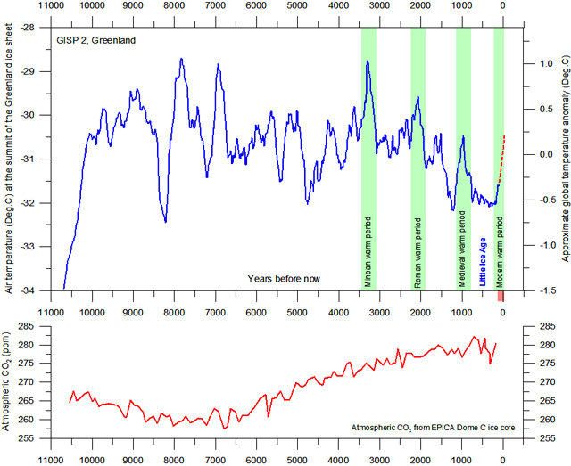
Fig.3. The upper panel shows the air temperature at the summit of the Greenland
Ice Sheet, reconstructed by Alley (2000) from GISP2 ice core data. The time
scale
shows years before modern time, which is shown at the right hand side of the
diagram. The rapid temperature rise to the left indicate the final part of the
even
more pronounced temperature increase following the last ice age. The temperature
scale at the right hand side of the upper panel suggests a very approximate
comparison with the global average temperature (see comment below). The GISP2
record ends around 1855, and the red dotted line indicate the approximate
temperature increase since then. The small reddish bar in the lower right
indicate the extension of the longest global temperature record (since 1850),
based on meteorological observations (HadCRUT3). The lower panel shows the past
atmospheric CO2 content, as found from the EPICA Dome C Ice Core in the
Antarctic (Monnin et al. 2004). The Dome C atmospheric CO2 record ends in the
year 1777.
The diagram above (Fig.3) shows the major part of the present interglacial
period,
the Holocene, as seen from the summit of the Greenland Ice cap. The approximate
positions of some warm historical periods are shown by the green bars, with
intervening cold periods.
Clearly Central Greenland temperature changes are not identical to global
temperature changes. However, they do tend to reflect global temperature changes
with a decadal-scale delay (Brox et al. 2009), with the notable exception of the
Antarctic region and adjoining parts of the Southern Hemisphere, which is more
or
less in opposite phase (Chylek et al. 2010) for variations shorter than ice-age
cycles
(Alley 2003). This is the background for the approximate global temperature
scale at the right hand side of the upper panel.
During especially the last 4000 years the Greenland record is dominated by a
trend
towards gradually lower temperatures, presumably indicating the early stages of
the
coming ice age (Fig.3). In addition to this overall temperature decline, the
development has also been characterised by a number of temperature peaks, with
about 950-1000 year intervals. It may even be speculated if the present warm
period fits into this overall scheme of natural variations?
The past temperature changes show little (if any) relation to the past
atmospheric CO2 content as shown in the lower panel of figure 3. Initially,
until around 7000 yr before now, temperatures generally increase, even though
the amount of atmospheric CO2 decreases. For the last 7000 years the temperature
generally has been decreasing, even though the CO2 record now display an
increasing trend. Neither is any of the marked 950-1000 year periodic
temperature peaks associated with a corresponding CO2 increase. The general
concentration of CO2 is low, wherefore the theoretical temperature response to
changes in CO2 should be more pronounced than at higher concentrations, as the
CO2 forcing on temperature is decreasing logarithmic with concentration.
Nevertheless, no net effect of CO2 on
temperature can be identified from the above diagram, and it is therefore
obvious
that significant climatic changes can occur without being controlled by
atmospheric
CO2. Other phenomena than atmospheric CO2 must have had the main control on
global temperature for the last 11,000 years.
The following diagram shows the period since 1850 (indicated by the reddish bar
in
the diagram above), where it is possible to estimate global temperature changes
from meteorological observations (Fig.4).
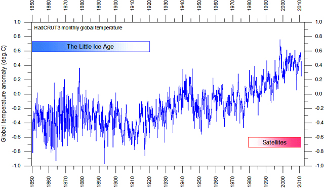
Fig.4. Global monthly average surface air temperature since 1979 according to
Hadley CRUT, a cooperative effort between the Hadley Centre for Climate
Prediction and Research and the University of East Anglia's Climatic Research
Unit
(CRU), UK. The blue line represents the monthly values. An introduction to the
dataset has been published by Brohan et al. (2005). Base period: 1961-1990. Last
month shown: December 2010. Last diagram update: 3 January 2011.